Visualising GCSE statistics using Datomic and Quil
If you are interested in Clojure, you’ve probably heard about Datomic. Datomic is a database that is not only suitable for storing data, but also for performing complicated queries, combining data and extracting information.
Another interesting Clojure project is Quil, which aims to bring the abstractions from the Processing framework into Clojure-land. Quil defines a drawing loop and gives access to functions for drawing at a canvas. Most Quil applications I have seen so far have been in generative art, but it is equally well suited for doing more complex data visualisation.
In this post I will be loading GCSE results data from 2011 and 2012 into an in-memory Datomic database and visualise it using Quil. This post walks through most steps of the process. The full listing can be found at github.
Loading GCSE data
I’m interested in comparing the GCSE results from 2011 and 2012, grouped on gender, subjects and results. In particular, I’m interested in examining which courses students performance have decreased in.
The dataset I’ve used can be downloaded from here. A html view of the data can be found here. The data has been altered slightly – the third row contained a wrongly formatted number. I have also removed the last six lines, which contain totals.
We are going to use Datomic and Quil, so we’re going to include the libraries.
(ns gcse-results.core
  (:use [datomic.api :only [q db] :as d])
  (:use quil.core))
Converting the csv-file into a sequence of the columns is quite easy
(defonce csv-data
  (->> "GCSEresults2012.csv"
     slurp
     clojure.string/split-lines
     (map #(clojure.string/split % #","))
     rest))
To get the data into Datomic, we first need to define a schema. We are only going to track C marks or above, as they are normally needed for gaining access to further education and jobs. Therefore, the schema will only contain data from that column.
(def schema-tx
  [{:db/id #db/id[:db.part/db]
    :db/ident :results/subject
    :db/valueType :db.type/string
    :db/cardinality :db.cardinality/one
    :db.install/_attribute :db.part/db}
   {:db/id #db/id[:db.part/db]
    :db/ident :results/gender
    :db/valueType :db.type/string
    :db/cardinality :db.cardinality/one
    :db.install/_attribute :db.part/db}
   {:db/id #db/id[:db.part/db]
    :db/ident :results/year
    :db/valueType :db.type/long
    :db/cardinality :db.cardinality/one
    :db.install/_attribute :db.part/db}
   {:db/id #db/id[:db.part/db]
    :db/ident :results/sat
    :db/valueType :db.type/long
    :db/cardinality :db.cardinality/one
    :db.install/_attribute :db.part/db}
   {:db/id #db/id[:db.part/db]
    :db/ident :results/c-or-above
    :db/valueType :db.type/bigdec
    :db/cardinality :db.cardinality/one
    :db.install/_attribute :db.part/db}])
Each line of the data is loaded into a seperate transaction. Here we are using datomic.api/tempid – the reader macro for creating ids will return the same id for each iteration in the loop, and can therefore not be used.
(def data-tx
  (for [[subject gender year sat no-sat a-star a b c d e f g u] csv-data]
    {:db/id (d/tempid :db.part/user)
     :results/subject (clojure.string/trim subject)
     :results/gender (clojure.string/trim gender)
     :results/year (Long/parseLong year)
     :results/sat (Long/parseLong sat)
     :results/c-or-above (BigDecimal. c)}))
We need to transact the schema and the data onto a database. As we do not need any persistence, we can use an in-memory database.
(def uri "datomic:mem://gcse-results")
(d/create-database uri)
(def connection (d/connect uri))
@(d/transact connection schema-tx)
@(d/transact connection data-tx)
We can now query Datomic. For example, we can get all individual subjects out
(q '[:find ?subject
     :where [_ :results/subject ?subject]]
   (db connection))
Visualising the data using Quil
In Quil, we define a function for setting up the view port
(defn setup []
  (smooth)
  (frame-rate 10)
  (background 255))
and a function for drawing on the canvas. Let’s start out with just painting the background white.
(defn draw []
  (background 255))
To see the result, we need to define a sketch.
(defsketch graph-sketch
  :title "GCSE results 2012 vs 2011"
  :setup setup
  :draw draw
  :size [600 600])
If you connect to nREPL and compile the code, the sketch is going to update according to your changes. I used that while developing the visualisation.
We are going to plot a 2D point for each subject. The first coordinate is going to be the number of students achieving C or above in that subject, 2011. The second coordinate is the same number for 2012. All elements above the line y = x will be subjects in which students have done better in 2012 than in 2011, and vice versa. We are going to stick to “Male” pupils for now.
(defn draw []

  (background 255)

  (let [map-x (fn [x] (map-range x 0 100 40 (- (width) 40)))
        map-y (fn [y] (map-range y 0 100 (- (height) 40) 40))
        results (q '[:find ?s ?c-2011 ?c-2012 ?sat-2012
                     :where
                     [?r-2011 :results/gender "Male"]
                     [?r-2012 :results/gender "Male"]
                     [?r-2011 :results/subject ?s]
                     [?r-2012 :results/subject ?s]
                     [?r-2011 :results/year 2011]
                     [?r-2012 :results/year 2012]
                     [?r-2011 :results/c-or-above ?c-2011]
                     [?r-2012 :results/c-or-above ?c-2012]
                     [?r-2012 :results/sat ?sat-2012]]
                   (db connection))
        sats (for [[ _ _ _ sat] results] sat)
        circles (for [[s c-2011 c-2012 sat-2012] results]
                  {:x (map-x c-2011)
                     :y (map-y c-2012)
                     :s s, :c-2011 c-2011, :c-2012 c-2012, :sat-2012 sat-2012})]

    ;; circles
    (doseq [{:keys [x y] :as circle} circles]
      (no-fill)
      (stroke-weight 1)
      (stroke (color 0))
      (ellipse x y 10 10))))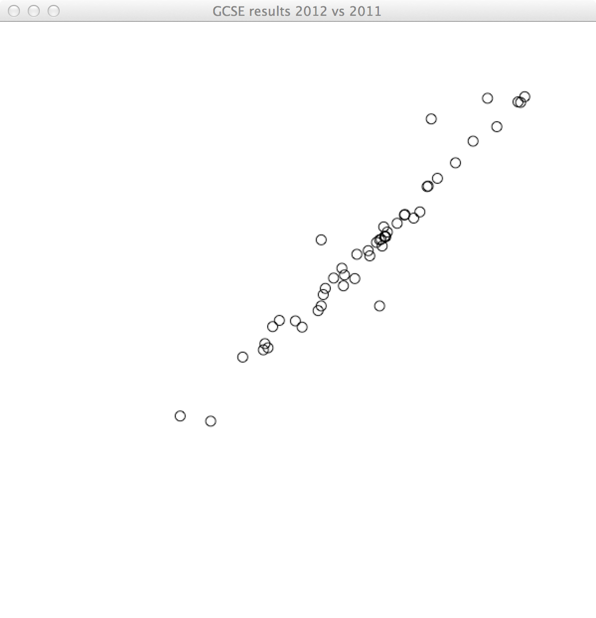
It can be quite difficult telling which points are above and below y = x. Let’s color the subjects in which the students are doing better blue, and the ones in which they are doing worse red.
(defn draw []

  (background 255)

  (let [map-x (fn [x] (map-range x 0 100 40 (- (width) 40)))
        map-y (fn [y] (map-range y 0 100 (- (height) 40) 40))
        results (q '[:find ?s ?c-2011 ?c-2012 ?sat-2012
                     :where
                     [?r-2011 :results/gender "Male"]
                     [?r-2012 :results/gender "Male"]
                     [?r-2011 :results/subject ?s]
                     [?r-2012 :results/subject ?s]
                     [?r-2011 :results/year 2011]
                     [?r-2012 :results/year 2012]
                     [?r-2011 :results/c-or-above ?c-2011]
                     [?r-2012 :results/c-or-above ?c-2012]
                     [?r-2012 :results/sat ?sat-2012]]
                   (db connection))
        sats (for [[ _ _ _ sat] results] sat)
        circles (for [[s c-2011 c-2012 sat-2012] results]
                  {:x (map-x c-2011)
                     :y (map-y c-2012)
                     :c (if (< c-2011 c-2012) (color 0 0 255 75) (color 255 0 0 75))
                     :s s, :c-2011 c-2011, :c-2012 c-2012, :sat-2012 sat-2012})]

    ;; circles
    (doseq [{:keys [x y c] :as circle} circles]
      (fill c)
      (stroke-weight 1)
      (stroke c)
      (ellipse x y 10 10))))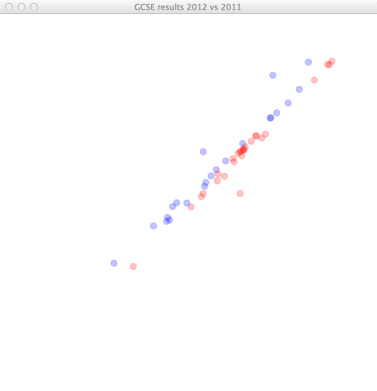
In our data, we can see that quite a different number of students sat the different subjects. Let’s scale the dots according to number of pupils who sat them. The area of the dot is going to be proportional to the number of students.
(defn draw []

  (background 255)

  (let [map-x (fn [x] (map-range x 0 100 40 (- (width) 40)))
        map-y (fn [y] (map-range y 0 100 (- (height) 40) 40))
        results (q '[:find ?s ?c-2011 ?c-2012 ?sat-2012
                     :where
                     [?r-2011 :results/gender "Male"]
                     [?r-2012 :results/gender "Male"]
                     [?r-2011 :results/subject ?s]
                     [?r-2012 :results/subject ?s]
                     [?r-2011 :results/year 2011]
                     [?r-2012 :results/year 2012]
                     [?r-2011 :results/c-or-above ?c-2011]
                     [?r-2012 :results/c-or-above ?c-2012]
                     [?r-2012 :results/sat ?sat-2012]]
                   (db connection))
        sats (for [[ _ _ _ sat] results] sat)
        circles (for [[s c-2011 c-2012 sat-2012] results]
                  (let [r (sqrt
                           (/
                            (map-range sat-2012 0 (apply max sats) 0.0 1.0)
                            PI))]
                    {:d (map-range (* 2 r) 0 1 0 50)
                     :x (map-x c-2011)
                     :y (map-y c-2012)
                     :c (if (< c-2011 c-2012) (color 0 0 255 75) (color 255 0 0 75))
                     :s s, :c-2011 c-2011, :c-2012 c-2012, :sat-2012 sat-2012}))]

    ;; circles
    (doseq [{:keys [d x y c] :as circle} circles]
      (fill c)
      (stroke-weight 1)
      (stroke c)
      (ellipse x y d d))))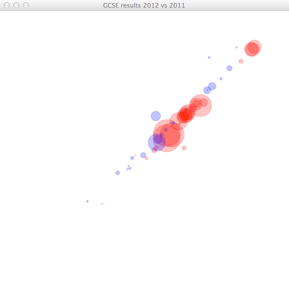
The image reveals that quite a lot of students seem to have done worse in three different subjects. However, we cannot tell which subjects they are. Let’s highlight the subject our mouse cursor is closest to, and print the name of the subject and the percentage of students achieving C or above for 2012 and 2011.
(defn draw []

  (background 255)

  (let [map-x (fn [x] (map-range x 0 100 40 (- (width) 40)))
        map-y (fn [y] (map-range y 0 100 (- (height) 40) 40))
        results (q '[:find ?s ?c-2011 ?c-2012 ?sat-2012
                     :where
                     [?r-2011 :results/gender "Male"]
                     [?r-2012 :results/gender "Male"]
                     [?r-2011 :results/subject ?s]
                     [?r-2012 :results/subject ?s]
                     [?r-2011 :results/year 2011]
                     [?r-2012 :results/year 2012]
                     [?r-2011 :results/c-or-above ?c-2011]
                     [?r-2012 :results/c-or-above ?c-2012]
                     [?r-2012 :results/sat ?sat-2012]]
                   (db connection))
        sats (for [[ _ _ _ sat] results] sat)
        circles (for [[s c-2011 c-2012 sat-2012] results]
                  (let [r (sqrt
                           (/
                            (map-range sat-2012 0 (apply max sats) 0.0 1.0)
                            PI))]
                    {:d (map-range (* 2 r) 0 1 0 50)
                     :x (map-x c-2011)
                     :y (map-y c-2012)
                     :c (if (< c-2011 c-2012) (color 0 0 255 75) (color 255 0 0 75))
                     :s s, :c-2011 c-2011, :c-2012 c-2012, :sat-2012 sat-2012}))
        mouse-dist (fn [{:keys [x y]}] (dist (mouse-x) (mouse-y) x y))
        mouse-inside? (fn [{d :d :as circle}] (< (mouse-dist circle) (/ d 2)))
        closest-to-mouse (if-let [touched (seq (filter mouse-inside? circles))]
                           (apply min-key mouse-dist touched))]

    ;; circles
    (doseq [{:keys [d x y c] :as circle} circles]
      (fill c)
      (stroke-weight 1)
      (stroke (if (= circle closest-to-mouse) (color 0) c))
      (ellipse x y d d))

    ;; closest circle
    (when-let [{:keys [d x y s c-2011 c-2012]} closest-to-mouse]
      (fill (color 0))
      (text-align :right :center)
      (text s (- x d) y)
      (text-align :left :center)
      (text (str c-2012 "% (" c-2011 "%)") (+ x d) y))))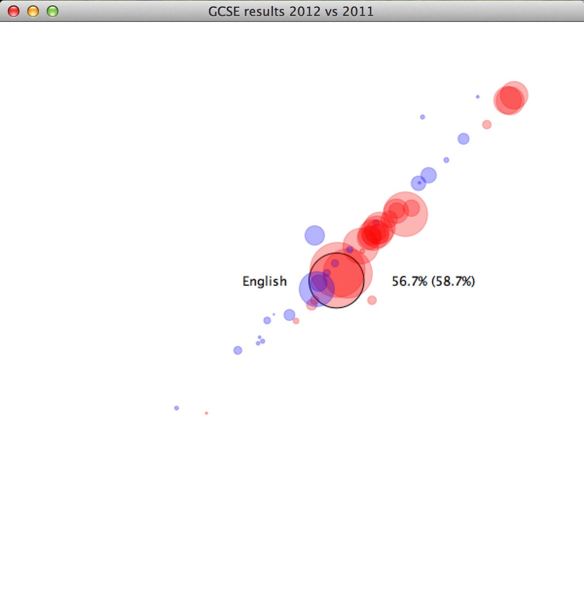
Alright, so now we can see that it’s Science, Maths and English that have fallen. This observation matches the critique of the new marking scheme issued 2012.
This is only data for boys. In the final version I have added a listener for keypresses to change gender, as well as axes. The full listing can be found at github.
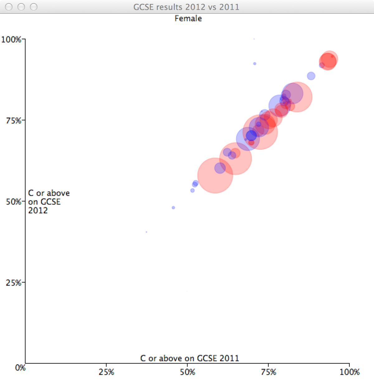
As we can see, girls are doing slightly better than boys in most topics, whereas the mixed group is slightly evened out.
Another interesting observation is that students generally have very good marks in Chemistry, Biology and Physics. This might be because these three subjects are usually combined in GCSE Science, and only the most able students are likely to take them as three seperate GSCEs. Particularly grammar schools and selective private schools tend to split Science into these three subjects, which means the data might be slightly skewed towards these schools in those three data points. Unfortunately, the dataset does not contain information about the types of schools.
Conclusion
In this blog post I wanted to demonstrate the visualisation of GCSE data from 2011 and 2012. The resulting program is an interactive data visualisation, coming in at under 200 lines of code, including database schema, parsing and visualisation.
Datomic has shown itself to be an extremely useful tool for performing data analysis. Performing queries to aggregate data is very natural. Likewise, Quil has been demonstrated as being capable of quite advanced visualisations with very little code.
I’m looking forward to seeing what types of data visualisations people will come up with, using these powerful, but very simple tools!
comments powered by Disqus